Wednesday 5 September 2012

Pudducherry!!


A solitary one from a series of sketches done during my trip to Pondicherry..shall upload a few more pretty soon.

Friday 25 May 2012

Rudro Screens!!


This poster was made for an upcoming student film-maker's film screening. The relevance of Capra's quote denotes the philosophy of the film. The poster was done in a Pop Art theme with very minimal information portrayed.

Sunday 8 January 2012

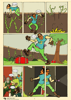
Comic book !!!


From the script to the final visuals it was quite a journey..It was great telling the story of Bhotbhoti Maiti, the regular Indian autodriver and his fantasy about his heroic exploits from the international news to the local fims...Although based in kolkata with a slight tinge of the bengali street  humour i feel it's an everyday indian story .Probably for me the time spent in creating him was one of the most exciting months spent in NID from it's research to it's execution....and i'm glad that everything finally fell into place..

Wednesday 4 January 2012

Chaostreet Titlecard!!

This was a title card for the "producton house" name that i had assumed for my first student project. the font is stereofidelic and a bit of dabbling with after effects finally helped me to come up with this short promo..

Fear poster


This was a typography based poster, done for a promotion for a student film in the horror genre.Multiple prints of this was all over the campus setting the tone for things to come later at the screening

Title Credits

This was a title sequence developed on the concept of a sci fi film based in the remote area of rajasthan which involved from trains to a top secret file gone missing UFO's and much more, this was an extension of an earlier promo that was created. The music in this case is from Pulp Fiction , Miserlou by Dick Dale and his Del Tones.

Promo..

This was a motion typography based promo made on the theme of sci-fi,where the name of the film read "cbslvt qr ijmke" to allow us  to not to be biased from the title but just play with type and it's movements. Sound was added later to give an additional effect.

The Posters..


This exercise dealt with the core aspects of poster design where the basic factors involved in developing a poster had to be maintained. In this case two set of posters basically derived from the same text had to be made.The lower one was my first attempt in making a solid information driven poster while in the top one the style had to be completely shifted to give it a psychadelic feel..

Wordplay!!


Wordplay was the idea of this exercise wherein a given set of words in this case being "restless" and "frustrated" had to be represented only through typography and not in a literal way but through the interplay of types and leading and font sizes.